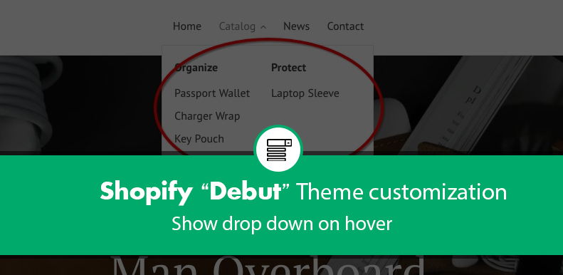
Step 1: Add this code in theme.scss.liquid
.site-nav--has-dropdown:hover .site-nav__dropdown,
.site-nav--has-dropdown:focus .site-nav__dropdown {
  display: block;
}

.site-nav__dropdown { top: 30px; }

.site-nav li { position: relative; }
Step 2: I commented out following code in theme.js
/*
cache.$parents.on('click.siteNav', function() {
      var $el = $(this);
      $el.hasClass(config.activeClass) ? hideDropdown($el) : showDropdown($el);
    });
*/
Step 3: In site-nav.liquid, comment out a <button></button> fragment and replaced it with a link:
 <a href="{{ link.url }}" class="site-nav__link site-nav__link--main{% if link.active %} site-nav__link--active{% endif %}">
    <span class="site-nav__label">{{ link.title }}</span>
 </a>

{% comment %}
   <button class="site-nav__link site-nav__link--main site-nav__link--button{% if link.child_active %} site-nav__link--active{% endif %}" type="button" aria-haspopup="true" aria-expanded="false" aria-controls="SiteNavLabel-{{ child_list_handle }}">
     <span class="site-nav__label">{{ link.title | escape }}</span>{% include 'icon-chevron-down' %}
   </button>
{% endcomment %}
Step 4: The mobile nav menu code is found in the header.liquid file in the Sections folder, so open that up in your editor and CTRL+F to find ‘mobile-nav__sublist-header–main-nav-parent’. Inside that span there should be another span that looks like this:
<span class="mobile-nav__label">{{ link.title | escape }}</span>
Delete that line and replace with the following:
<a href="{{ link.url }}" class="site-nav__link site-nav__link--main{% if link.active %} site-nav__link--active{% endif %}">
      <span class="mobile-nav__label">{{ link.title | escape }}</span>
</a>